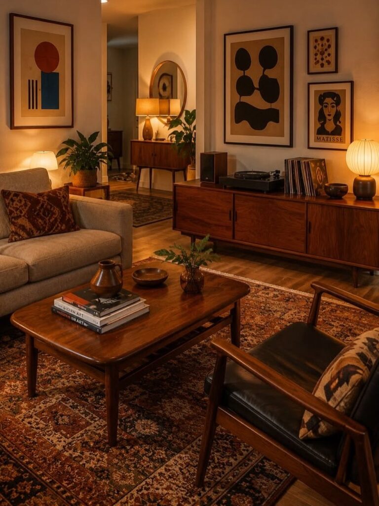
These ideas run from a single paint sample to full wood paneling you commit a weekend to, and the right one depends on whether you can change the wall back when you leave.
A peel-and-stick geometric paper or a burnt orange swatch you test first both suit renters; wood planks nailed to studs do not. Grasscloth runs above standard wallpaper, which is why I would keep it to the wall behind a headboard.
1. Wood Paneling

Real wood paneling brings the warmth that defines mid-century modern spaces. I prefer vertical planks for the clean lines the era is known for, and I’d pick wider boards when the room needs more texture against flat upholstery.
Oak or teak tones give that cozy retro feel; walnut stains beautifully on less expensive hardwoods if budget matters. Check what species are priced lower in your area and match the stain to your space.
A stone fireplace paired with the wood adds contrast, though the paneling alone works if your room already has enough focal points. This suits renters less; it’s a commitment in both cost and installation time.

𝗠𝗼𝗱𝗲𝗿𝗻 𝟯𝗗 𝗧𝗲𝘅𝘁𝘂𝗿𝗲𝗱: 3D wood slat design creates depth and visual interest while enhancing sound absorption. Great for Bedroom, office to reduce echo and noise, both practical and stylish

SPECIFICATION: A single package contains 12 3d decorative wall panels, 19.7"x19.7"x0.12" each, covers about 32.4 square feet. NOTICE: Tape not included

Reclaimed Wood Panels: Reclaimed wood paneling for walls is designed to create accent walls, feature walls, and interior spaces; these wall board panels feature a barnwood look with rustic color variations, reflecting the unique story of each piece
2. Gallery Walls

A gallery wall lets you build the look piece by piece instead of committing to one big change. Vintage abstract or geometric prints from the period carry the style without needing everything else in the room to match.
I hang the center piece where most people walking through naturally look, roughly at standing eye level. Mixing frame sizes and finishes keeps it from feeling too staged; a little unevenness reads as collected rather than bought as a set.
This works well when you already own a few prints and want to use them. Arranging takes time before you commit to nails.

High-Quality Wall Panels: Our acoustic panel set is crafted with high-density polyester fiber, premium medium-density fiberboard, and a solid wood veneer. This combination provides an elegant look, superior sound damping, and excellent sound deadening, significantly improving room acoustics

Superior Acoustic Performance: It is designed to provide excellent noise-cancellation capabilities, making it ideal for use in homes, offices, studios, and other spaces where acoustic quality is a priority

Modern Wood Wall Panel Design: These wood panels for wall feature a clean 3D slat structure that enhances interior walls with depth and texture, delivering a refined, professional look for residential and commercial spaces.
3. Burnt Orange Accent Wall

Burnt orange reads as mid-century modern because it was everywhere in the era’s actual homes, not just the magazines. The shade works best when the room gets enough natural light to keep it from going muddy in the evening.
I would test a large swatch and live with it a while, checking morning and night.
Mustard yellow plays the same role if orange feels too bold for your space; both are warm, earthy choices that read as intentional rather than trendy.
Paint is the cheapest accent wall to undo, which makes this ideal for first-home owners still learning what they can live with. Skip it if your room’s main furniture already carries strong color; let one element do the work.

This product is Non-toxic

PERFECT SIZE & BRILLIANT COLORS - This line of vibrant, multi-surface acrylic paint is the perfect addition to any collection of art supplies! This craft paint comes in a 8 oz bottle

[Framed Wall Art]: This set of 3 large framed neutral abstract wall art features warm orange and beige tones layered with soft white accents, creating a harmonious, modern composition. Each panel measures 24 x 36 inches and comes with a sturdy frame with a 1.38-inch frame thickness, bringing a sophisticated and balanced visual presence to contemporary living rooms, dining rooms, and large interior spaces
4. Geometric Wallpaper

Geometric wallpaper carries the pattern load so the rest of your furniture can stay simple. Large circles or triangles in saturated greens, yellows, and teals hit the retro note without looking dated.
I would paper above a chair rail or wainscoting if your room has it; covering half the wall keeps the pattern from overwhelming a small space. Full wall coverage works better in rooms with minimal competing details.
Peel-and-stick options have improved enough that renters can use this too, though the cost runs higher than paint. Check that your wall surface is smooth enough; textured drywall shows through and ruins the crisp lines.

【Geometric Peel and Stick Wallpaper】–This geometric wallpaper uses thick textured vinyl with soft stone-like detail, ideal for rental upgrades, kitchen backsplash, bathroom accents, or bookshelf panels, offering smooth trimming and clean application on flat walls

【SIZE & MATERIAL】 1 roll arch geometric wallpaper is 17.5 inch x 160 inch ≈ 19.4 sq.ft. Renter friendly wallpaper. Made of premium vinyl.

𝐌𝐨𝐝𝐞𝐫𝐧 & 𝐀𝐛𝐬𝐭𝐫𝐚𝐜𝐭: Featuring a hand-drawn geometric pattern in sage green and cream color, adds a sophisticated mid-century modern or boho-chic touch to any room. Each roll measures 17.7 inches wide by 118 inches long, covers 14.5 square feet, straight match
5. Grasscloth Wallpaper Accent Wall

Grasscloth adds the texture that mid-century modern rooms need to keep flat planes of color from feeling sterile. The woven fibers catch light differently through the day, which gives a living surface that paint cannot match.
Bedrooms suit this especially well; the texture reads as calm against bedding and the slight irregularity hides minor wall imperfections. I would keep the rest of the room’s materials simple so the grasscloth remains the interest point.
Installation takes patience and good adhesive; the seams show if rushed. Cost runs above standard wallpaper, so I would use it on one wall behind a headboard rather than wrapping a whole room.

⚠️ 𝐀𝐭𝐭𝐞𝐧𝐭𝐢𝐨𝐧: For latex walls or repainted, 3M spray adhesive is recommended as assist ❗❗

🚪 -【Grasscloth Wallpaper】:The size of each roll is 17.7"×200" (1.47x16.4 ft), covers an area of 24.2 sq.ft. Strong coverage and available in a variety of sizes. Upgrade and thickened grasscloth wallpaper, more durable.

【Material &Size】Each roll measures 15.8"W x 80"L, covering around 8.7 sq.ft. Made of thick, durable vinyl fabric, this faux grasscloth wallpaper is non-toxic and safe for your whole family. Built-in grid lines on the backing allow for accurate measuring and effortless cutting
6. Olive Green Accent Wall

Olive green carries the organic, grounded feeling that mid-century modern color palettes always return to. It pairs naturally with wood tones and reads as neutral enough to live with for years.
I would use it behind a television or media console, where the dark value helps screens disappear visually when off.
Floating shelves in natural wood against this color need no styling to look intentional; a few plants and frames complete it.
The shade works best with warm white trim rather than stark bright white, which can make olive read as muddy. Test your sample against existing wood furniture before buying the gallon; undertones vary sharply between brands.
Warm browns are always welcome in a midcentury modern living room as seen here with a low-slung coffee table and simple leather stool. The enveloping warmth of an accent wall in Incense Stick 2115-20 showcases the power of rich brown colors in midcentury modern design.

Real Wood Wall Planks: 100% Real Barn Wood Wall Planks With Natural Knots and Dents, the Surface Of Wood Shiplap Planks Is Processed With High Temperature Carbonization, the Real Wood Wall Shiplap Planks Is Non-Toxic, Sterilized and More Safe For Children, Voc Free Process Ensures These Stick on Shiplap Planks For Walls Are Safe To Use In Home
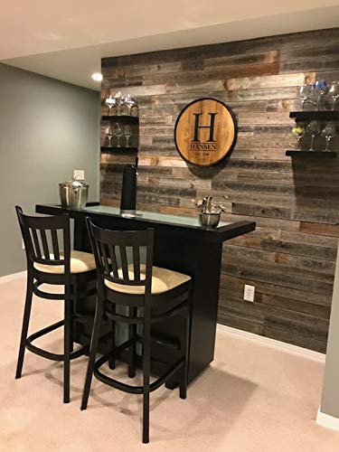
✔️100% REAL wood with adhesive strips on the back that are easy to install

🪵 Authentic Reclaimed Barnwood: Made from 100% authentic, real weathered wood, reclaimed in Oklahoma, USA for true rustic character.
7. Blue-Grey Accent Wall

Blue-grey reads as neutral in some light and quietly colored in others, which makes it forgiving on a wall that catches both morning sun and lamp light.
Paint is the cheapest way to get there. I would test a swatch on the actual wall and watch it across a full day before buying the can; this shade shifts more than most between cool and warm light.
If the room already runs warm with wood cabinets and honey-toned floors, the cool cast of blue-grey steadies the whole thing.
A portrait or single large piece hangs cleaner here than a busy gallery. The wall does enough work on its own.
Best for renters who want color they will not have to repaint before move-out, and for anyone whose furniture already mixes wood tones that need quietening down.
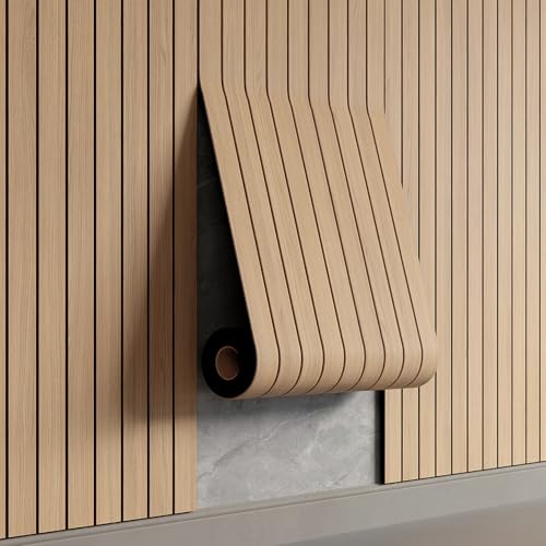
Effortless Peel & Stick Installation--Enjoy hassle-free setup with our self-adhesive PVC slat panels! Just measure, peel off the backing, and press onto any clean, flat surface—no tools or expertise needed. Perfect for DIY beginners and quick home makeovers.
Effortless Peel & Stick Installation--Enjoy hassle-free setup with our self-adhesive PVC slat panels! Just measure, peel off the backing, and press onto any clean, flat surface—no tools or expertise needed. Perfect for DIY beginners and quick home makeovers.

Modern and Elegant Design - The wood slat wall panels have been carefully designed to effortlessly transform any space, enhancing the surroundings both visually and acoustically. The wood panels help to create an environment that is not only quiet but beautifully contemporary, soothing and relaxing. Furthermore, our slat wall panels can be installed horizontally or vertically and cut to any shape allowing for creativity and a unique look to fit your aesthetics.
Best Colors for Accent Walls
I’d use them when you want the mid-century feel without a single wall dominating the room.
Red works as an accent, though I’d keep it to a small wall or a recessed nook where it can surprise without overwhelming.
The contrast matters more than the specific hue: if your sofa is neutral, the wall carries the color load; if your furniture already runs warm with teak or walnut, a cooler accent wall steadies the eye.
Save grey and beige for the other three walls. An accent wall in a neutral reads as unfinished, not intentional.

Suitable for interior surfaces such as walls, ceilings, furniture, trim and more


【Abstract Wall Art Size】 Each Canvas Panel Is 20x40inch(50cmx100cm)Total 1 Panels.
DIY Tips
A tape measure and level matter more than any power tool here. I mark the wall in pencil before cutting or sticking anything; the 10 minutes of measuring save an hour of fixing.
Adhesive strips and construction glue work for lighter materials. Peel-and-stick wallpaper and veneer panels go up with a straight edge and patience rather than a nail gun.
For wood paneling, a brad nailer speeds things up if you own one, though finishing nails and a hammer still get the job done.
I would rent the nailer for a single wall rather than buying; a day rate beats storing a tool you use once a year.

[Upgrade Material]: The 17.7"x118.1" wallpaper is made of PVC material, with delicate surface texture and strong three-dimensional effect. The wallpaper adopts a three-layer non film covering structure, which can effectively avoid reflection. To ensure patterns match, please buy the same width; different widths have different pattern sizes.


𝐏𝐫𝐨𝐝𝐮𝐜𝐭 𝐃𝐞𝐭𝐚𝐢𝐥𝐬: Geometric wallpaper, mustard yellow color, arches pattern, boho style, made of thick vinyl, durable. 17.7 inch wide by 118 inch long, covers 14.5 Sq. Ft. each roll, straight match
Materials for Wood Walls
Pine keeps the weight down and the cost low, which matters when you’re covering a full wall on a weekend budget. I would use boards under 3/4 inch thick so the wall does not project too far into the room.
Wood veneer panels give the surface grain of real wood without the $20–$50 per square foot that solid oak runs. The veneer surface is the detail that separates this look from the laminate panels that aged badly.
MDF works as a base if your wall needs new structure, though I’d only use it where the real wood surface shows.
Reclaimed wood adds variation in tone and grain; each piece carries marks that read as history rather than flaw.

TEXTURED WALLPAPER: Unlike plain biege wallpaper, this light biege grass cloth wallpaper features subtle vertical stripes and a softly textured finish that add depth and...
Creating Visual Interest
The wall should pull the eye the moment you enter the room.
Bold color does the work in a neutral room. In a space already carrying ochre upholstery or a patterned rug, I’d switch to texture instead: grasscloth or wood grain become the interest without adding another hue to compete.
A single large piece or a tight grouping reads as one focal point. Scatter too many small elements and the wall loses the force that makes it an accent rather than just another surface.
Frequently Asked Questions
What are some good accent wall colors for a mid-century modern space?
Burnt orange and mustard yellow carry the style best, since both showed up in actual mid-century homes rather than just magazine spreads. Olive green and blue-grey work too if you want something quieter that still reads as intentional.
A 2-foot square painted on the wall will look completely different at 8 AM and 8 PM; these colors move around that much.
Are accent walls out of style in 2026?
One painted wall still does what it has always done: it pulls your eye to a single spot without making the whole room fight for attention.
They keep turning up in new mid-century rooms because the style itself never really left; the look just keeps getting borrowed by another generation.
Is mid-century modern still in style in 2026?
Mid-century modern design continues to be popular and relevant. The clean lines, natural wood finishes, and bold but earthy colors keep showing up in current interiors because they balance well with newer pieces.
I see the style less as a trend that expires and more as a vocabulary that keeps getting reused.