These 13 flooring tile ideas run from a weekend DIY stack of 24 by 48 inch porcelain to a waterjet marble medallion that demands a specialist, and the deciding factor is how much disruption your household can take at once.
A checkerboard can reset an entryway fast enough to still cook dinner that evening; a Versailles pattern with its multiple sizes and pre-sorted bundle asks more of your schedule and your contractor’s goodwill.
Herringbone is where I would send anyone who needs proof that a first-timer can still get a custom look.
1. Herringbone Pattern Tile

Herringbone tile turns plain rectangles into a zigzag that pulls the eye across the floor.
The 45-degree angle matters: each tile meets the next at a straight edge, not a mitered point like chevron, so standard cuts work and the pattern stays forgiving for a first-timer.
I like it best in narrow spaces, hallways or galley kitchens, where the direction tricks the eye into seeing more width than there is. The extra grout lines add grip in wet areas too.
Cost runs higher than a straight stack because of the cuts and the waste, and I would order extra material from the start rather than make a second trip mid-project.
For a weekend project, stick to a small bathroom or a single entry strip rather than a whole living room.

Includes 12 Pieces per Case | 5.16 Square Ft. Per Case | Case Weight 34.8 lb |TILE SIZE: 8 in. W x 8 in. L x 0.55 in. T

FULL COVERAGE PACK – Includes 24 sheets of 8"x8" peel and stick wallpaper tiles. One package covers 10.67 sq. ft. (1,536 sq. in.), perfect for kitchen backsplashes, wall décor, and creative DIY projects.

【Herringbone DESIGN】herringbone patterns look very unique.realistic appearance like marble,3d brick relief effect,not suitable for walls with powder on the surface
2. Wood-Look Tile

Wood-look tile gives the warmth of oak or walnut without the panic over a spilled glass of wine. Waterproof and indifferent to dog nails, this is the choice for kitchens, mudrooms, anywhere hardwood would suffer.
The underfoot feel is the real trade: tile stays cold and hard, so I would budget for a quality underlayment or reserve this for rooms where radiance or rugs already soften the floor.
Grout color makes or breaks the illusion; match it to the mid-tone of the grain, not the lightest or darkest streak.

1. Authentic Wood Grain & Textured Finish - Realistic wood look with natural knots, tonal variations, and deep embossed grain. Low-gloss surface adds timeless style to any room.

Chic Design & Wood Texture - Classic herringbone pattern with realistic wood grain texture, combining classic charm with the rustic beauty of natural wood, add a touch of earthy warmth to your interiors.

Double the Width: Our premium wood grain tiles are 11.8 inches wide, offering double the coverage of standard tiles, making installation and renovation a breeze. Ideal for peel and stick flooring solutions
3. Patterned Tiles

Patterned tile is where a floor becomes wallpaper you can walk on. A blue and white palette reads traditional, but the same approach works in black ink on white, or warm terracotta, depending on the room’s light.
Porcelain handles wet areas, cement stays porous and needs sealing, glass shifts underfoot and suits low-traffic spots only.
I would test the scale against your square footage: a bold print in a powder room feels intentional, the same print across an open kitchen can exhaust.
Order extra before the run sells out; these designs date and matching later is unlikely.
For a budget check, patterned field tile usually costs more per square foot than plain, and the install takes longer because every piece must orient correctly.

VINTAGE DECORATIVE DESIGN – Features an elegant geometric floral pattern with interlocking circular and oval motifs, bringing Mediterranean, Spanish, and old-world European charm to kitchens, bathrooms, and accent spaces.

Captivating Vintage Appeal: Infuse your space with the timeless charm of our Tenedos 3/4" Vintage Green Glossy Round Mosaic Tile. Featuring small, circular green tiles arranged in an elegant honeycomb pattern, this mosaic evokes the sophisticated style of Art Deco, perfect for adding a unique vintage touch.

Durable Polyester: The 100% polyester faux-linen fabric gives this round tree skirt a textured decorative surface while remaining lightweight and easy to position around real or artificial tree bases
4. Mosaic Tiles
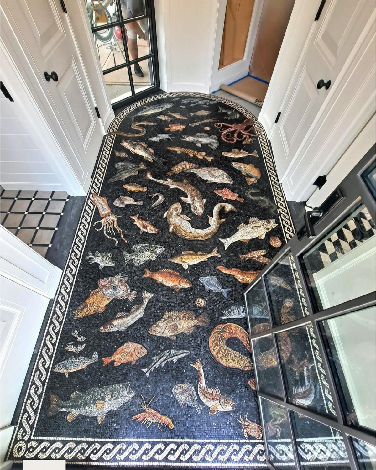
Mosaic tile is the one flooring choice where you can commission a school of fish for your hallway and not seem unhinged.
The small pieces and frequent grout lines create natural traction, which makes mosaic practical in a shower or bath even when the pattern reads purely decorative.
Real marble mixed with porcelain, as in some current lines, stretches the budget while keeping the wet-area performance. I find mosaic demands a contained space: a bath floor, a vestibule, a single border stripe.
The install is slow, the grout maintenance real, and a large field of tiny tiles can feel busy fast. For a DIY attempt, start with a pre-mounted sheet on a small job; individual pieces are a craft, not a weekend.

Artistic Floral Checkerboard Design: These peel and stick vinyl floor tiles blend vintage black-and-white diamond grids with hand-painted wildflower motifs—great for boho, French country, or eclectic interiors.

[Easy Installation & Modern Aesthetics]: Larger 24"x24" peel and stick tiles (vs. standard 12"x12") simplify alignment and reduce installation time, perfect for spacious living rooms or open areas. The seamless marble design adds timeless elegance to your vinyl floor tiles

COVER 48 SQ.FT. - 12 tiles (24'' × 24'') eva foam floor mats Interlock together covers approx. 48 square feet of the floor area, perfect space for gym equipment or workout on it, and also safe for kids as playground.
5. Marble Look Tile
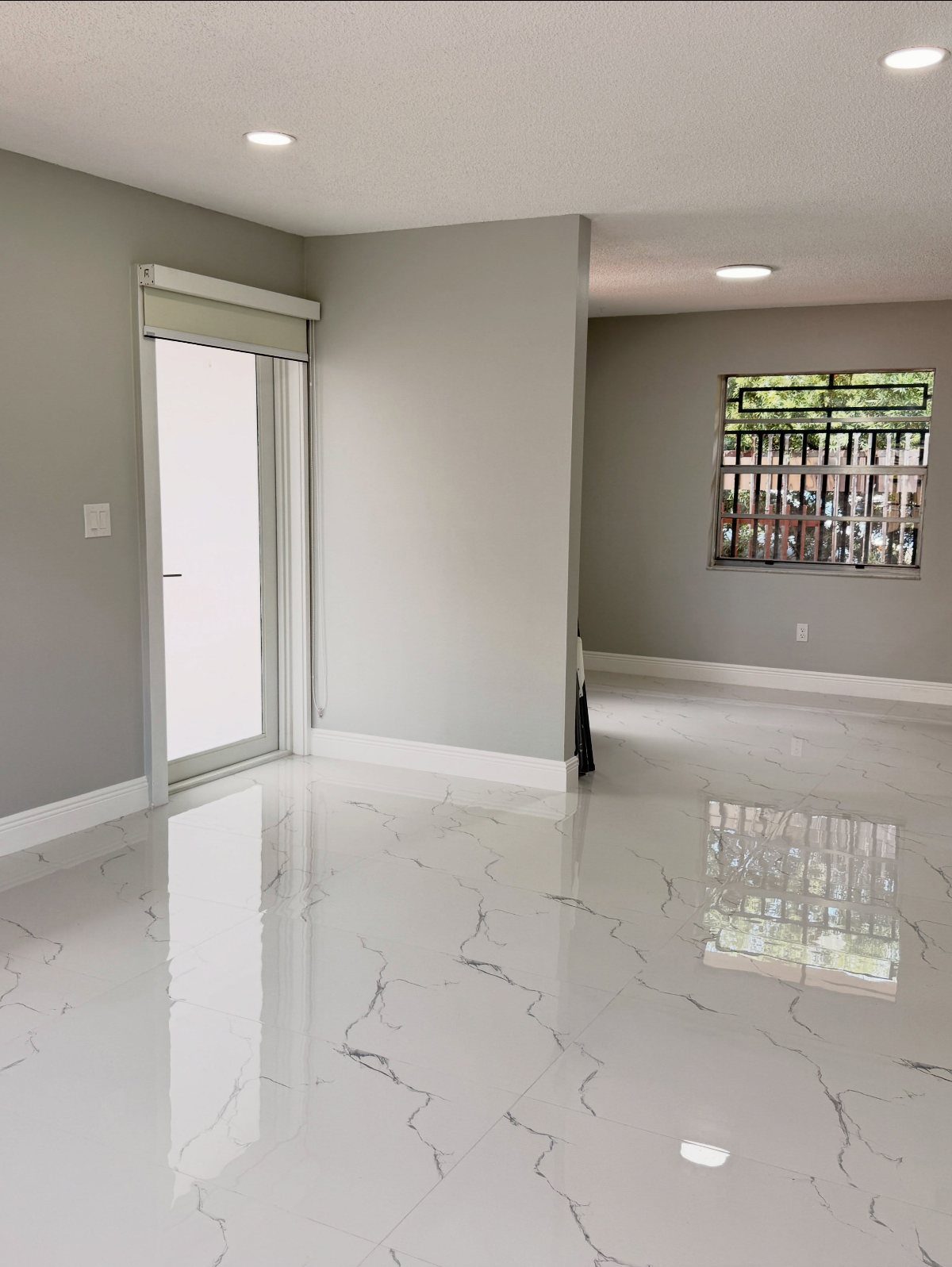
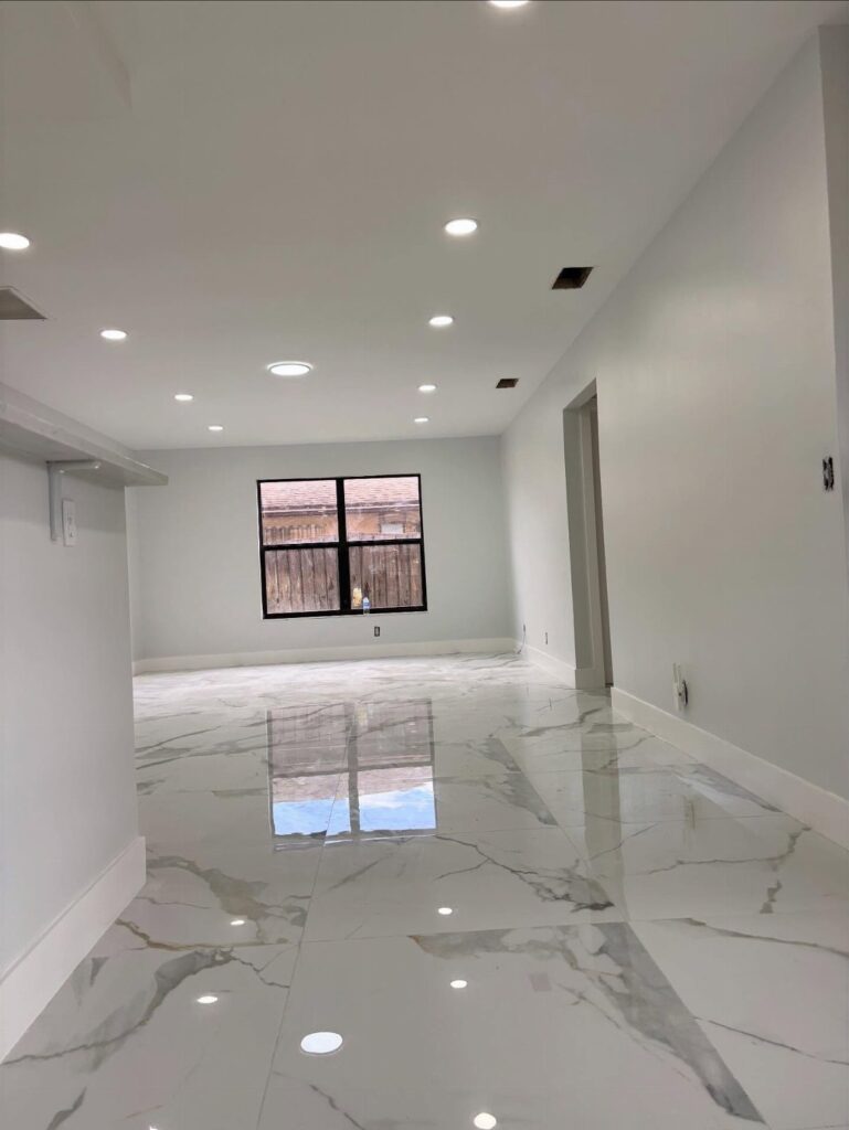
Marble-look tile has reached the point where I have to kneel to confirm it is porcelain. The veining now runs edge to edge, and manufacturers rotate the faces so repeats do not line up and betray the trick.
Real marble etches with lemon juice, stains with red wine, demands sealing and still frets; this alternative shrugs off all of it.
I would use it anywhere I wanted the cool formality of stone, especially foyers and baths where the real thing would spend its life under warning.
Polished white with grey veining is the expected look, but the technology has pushed into colors no quarry produces, soft blues and warm greens, for rooms where classic white feels too safe.
Budget for the larger format if the space allows; fewer grout lines keep the illusion intact.

Premium Quality Glaze Tiles:These ceramic tiles are fired at high temperatures to ensure durability and resilience against outdoor conditions. Designed to withstand both outdoor conditions and water exposure, they are perfect for outdoor use, promising longevity and enduring beauty for your space

4 shapes mixed in each package - These mosaic pieces come with Square, Rectangle, Diamond and Triangle. Having all these precut beautiful shapes will not only save you a tremendous amount of time, but will also inspire you when trying to create new designs
4 shapes mixed in each package - These mosaic pieces come with Square, Rectangle, Diamond and Triangle. Having all these precut beautiful shapes will not only save you a tremendous amount of time, but will also inspire you when trying to create new designs
6. Large Tiles

Large-format tile, 24 by 48 inches and still growing, turns a floor into a near-solid surface with grout lines so sparse they almost disappear.
The visual expansion is real; I have seen a modest galley kitchen read like a loft after the switch from small squares to tiles that carry the eye across the whole floor.
Fewer grout lines also means less scrubbing and less visual fracture, though the install is not forgiving.
Lippage, that slight step between adjacent tiles, shows immediately at this scale, so a level subfloor is non-negotiable and usually means hiring out the prep.
I would reserve this for open plans where the continuity pays off, and I would check the tile’s rectification, true edges that allow the tightest grout joints.
The material cost runs higher, but the labor often balances because the coverage per piece is so fast.

8" x 8" turn of the century retro design with 21st century color sensibilities
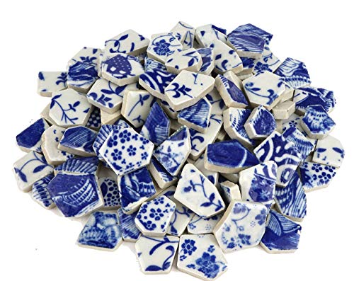
Beautiful Cobalt BLUE & WHITE floral patterns

Peel and stick tile panels with a high shine finish
7. Checkerboard Pattern Tile
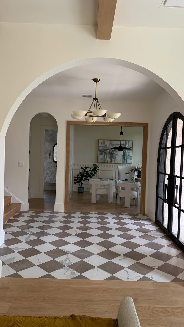
Checkerboard floors read as formal without trying too hard, which makes them useful in entryways where you want impact on a budget.
The diagonal layout matters more than the tile price: turning the squares 45 degrees pushes the walls outward visually, and that trick works in a 10×12 room as much as a grand foyer.
Marble-look porcelain in two tones gets you the same graphic punch as real stone for a lot less money, and you skip the etching and sealing headaches too.
I would lay out the full grid dry before cutting anything; checkerboard forgives nothing if the alignment drifts.
Skip this if your space already has strong pattern elsewhere. One bold element per sightline is usually enough.

[Realistic Wood Grain with DIY Options]: With a super realistic wood grain appearance and various color options, these tiles meet personalized decorative needs. They are versatile enough for use in homes or commercial spaces, suitable for shop decoration, rental renovations, and RV flooring projects.

PEEL-AND-STICK: No tools, no glue. Just peel&stick, and transform your space in minutes. You can achieve professional wood-looking results even as a first-timer. Reposition during installation for perfect alignment — it's forgiving and foolproof. Many customers complete an entire room floor in just 1-2 hours.

Stylish - Authentic wood looking and grain texture, adding timeless feature for your home.
8. Versailles Pattern

The Versailles pattern looks like it grew there over centuries, which is exactly why I would not put it in a house full of clean lines and flat-panel cabinets.
It needs multiple tile sizes, and the math only works if your supplier sells them as a pre-sorted bundle with the layout map included.
Porcelain versions hold up better than natural stone in kitchens where acids and spills are daily events. Travertine or slate reads warmer but demands sealing on a regular schedule or it stains.
The install is slow. A contractor who quotes by the square foot may flinch or price it high; someone who has done parquet before will recognize the pattern and price it as a specialty job.
Ask specifically.

Durable Polyester: The 100% polyester faux-linen fabric gives this round tree skirt a textured decorative surface while remaining lightweight and easy to position around real or artificial tree bases

Durable Polyester: The 100% polyester faux-linen fabric gives this round tree skirt a textured decorative surface while remaining lightweight and easy to position around real or artificial tree bases

Durable Polyester: The 100% polyester faux-linen fabric gives this round tree skirt a textured decorative surface while remaining lightweight and easy to position around real or artificial tree bases
9. Brick Look Tile Floor
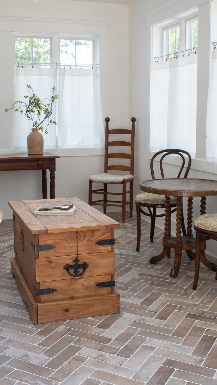
Brick-look porcelain solves the real problem with actual brick floors: they are cold, uneven, and murder on dropped glassware.
The texture still reads as old and settled, especially in a herringbone or running bond layout where the staggered joints hide the repetition of printed patterns.
For a mudroom or sun porch, the porcelain rating matters.
Look for "through-body" color and a PEI wear rating of 4 or higher; the tileshop notes on weather resistance only hold if you buy the right grade, not the decorative wall version by mistake.
I would grout in a tone slightly darker than the lightest brick color. Too light and every gap screams; too dark and the floor turns into a grid.
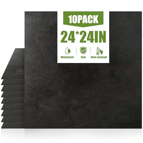
【Size& Package】Each self-adhesive floor tile measures 23.62 x 23.62 inches and is 0.05 inches thick. A set of 10 tiles covers an area of 38.8 square feet.

48 Tiles Cover 48 Sq. Ft.: Each 12 x 12 in peel and stick floor tile is 0.04 in / 1 mm thick. The 48-piece pack covers 48 sq. ft., making it suitable for updating bathrooms, kitchens, bedrooms, laundry rooms, and apartments

Quick & Easy Installation – Interlocking tiles snap together effortlessly for a high-end look and exceptional floor protection—no tools or adhesives required.
10. Hexagon Geometric Tile
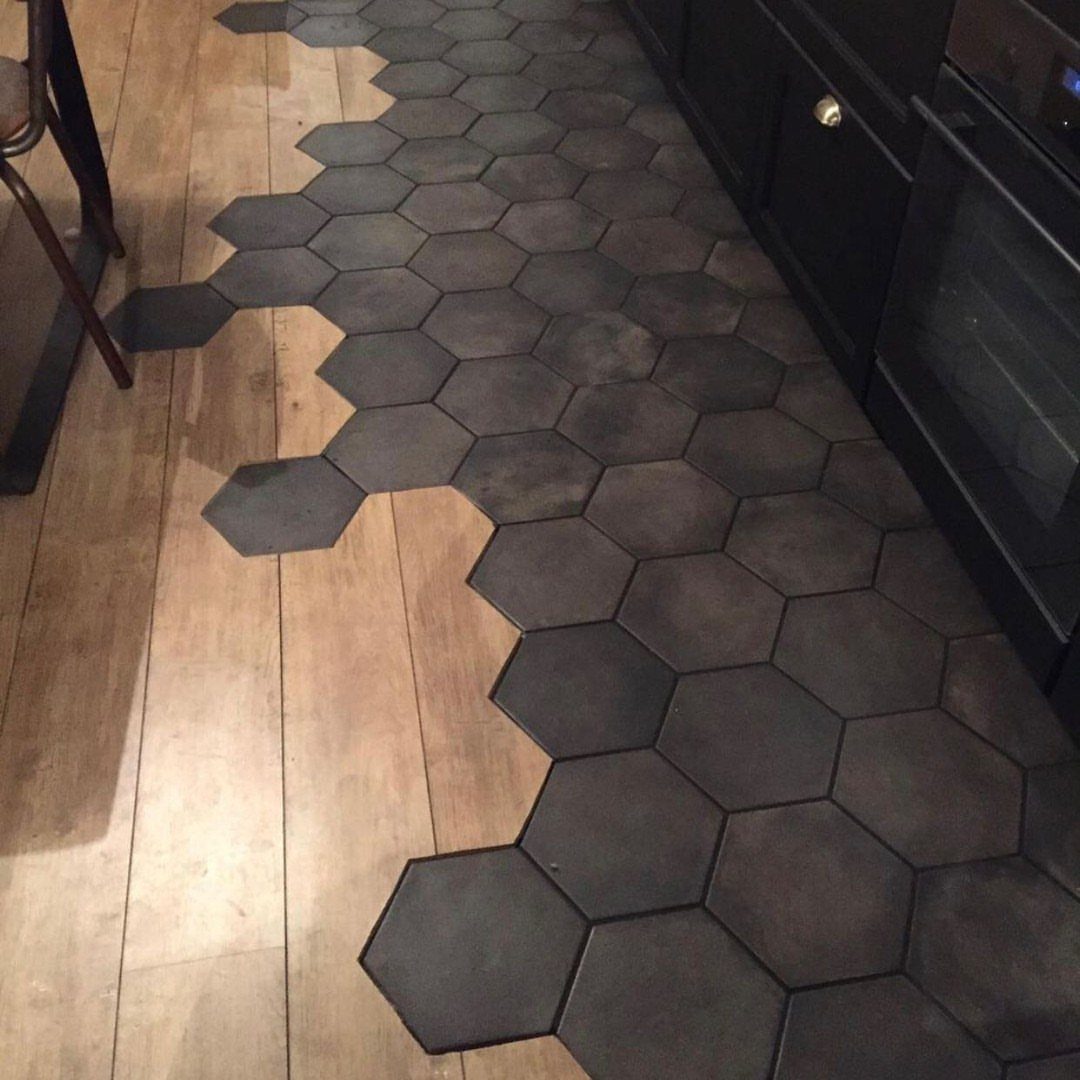
Hexagons broke out of bathroom niches a while back and now mix with wood plank floors in kitchens where someone wanted geometry without rigidity.
The jagged edge where hex meets plank is the detail that makes it; a straight transition line would look like a mistake.
Small hex mosaics are the cheap entry point, usually mounted on mesh-backed sheets that speed up install. Large format hex tiles cost more per piece but install faster and read more modern.
The sheeted mosaics suit bathroom floors and shower pans; the big ones need a flat subfloor and a leveling system to keep lippage down.
I would not try this as my first tile job. The cuts where hexagons meet walls or other materials are irregular and unforgiving.

4 shapes mixed in each package - These mosaic pieces come with Square, Rectangle, Diamond and Triangle. Having all these precut beautiful shapes will not only save you a tremendous amount of time, but will also inspire you when trying to create new designs

4 shapes mixed in each package - These mosaic pieces come with Square, Rectangle, Diamond and Triangle. Having all these precut beautiful shapes will not only save you a tremendous amount of time, but will also inspire you when trying to create new designs

Great Value Pack: Contains 300G (0.66LB) Stunning Square Crystal Mosaic Tiles, Approximately 335 Pieces of 1 x 1 cm, Covering 0.36 sq ft in 1 Package
11. Decorative Tile Borders
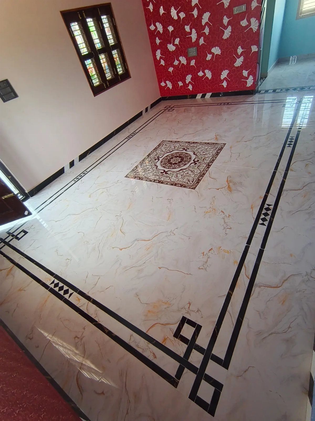
A border is where you spend a little to look like you spent a lot. One band of geometric black tile, kept narrow, around a field of plain white or cream marble-look porcelain turns a standard install into something intentional.
Proportion makes or breaks it. In a small room, a wide border eats the floor; in a large one, a narrow strip gets lost.
I would mock it with painter’s tape before ordering anything. Medallion centers work the same way: one well-placed inset reads as custom, three of them read as a hotel lobby.
Porcelain borders cut with a wet saw; natural stone borders often need to be ordered pre-cut to size. Factor that lead time in.
12. Marble Tile Medallion Floor

A marble medallion is the one idea here I would not attempt myself. The cutting is waterjet work, the layout is a full-scale template affair, and the polished surface shows every height variation.
This is hire-a-specialist territory, and the specialist needs to see your field tile before cutting the medallion to fit.
I have seen these work best in foyers where they sit under a round entry table, the furniture echoing the circle.
If the quote shocks you, consider a single accent panel as a compromise. Same focal point, less labor, less material, still custom.
13. Metallic Patina Tile

Metallic patina tile gives porcelain the look of aged copper or brushed steel without the dents and scratches that real metal collects in a bathroom.
The surface carries a subtle wave, so the light shifts as you move across the room.
I would use this in a powder room or a main bath where you want something darker than standard white or gray but cannot commit to actual metal upkeep.
The large-format pieces read as metal plates laid in place, and porcelain handles water and dropped hairdryers without complaint.
A navy variant exists if copper tones feel too warm for your cabinets.
Either way, the tile works best with matte brass fixtures and wood that has some live-edge character to it; too much polished chrome turns the room into a showroom.
The texture catches dust more than a flat surface, so plan on a quick mop rather than a simple sweep.
Installation Tips
A level subfloor matters more than the tile you choose.
I would check with a long level and a straightedge before opening a single box; high spots get ground down, low spots get filled, and anything skipped now telegraphs through forever.
For adhesive, the bag matters: thinset for porcelain, mastic only for dry walls, and epoxy for glass or metal. The wrong bond means tiles that sound hollow when you tap them later.
Dry lay before you mix any mortar. I would start in the center and work toward the walls, measuring twice at the edges where cuts hide.
For patterns like herringbone or Versailles, that dry run is not optional; the pattern intersects walls at odd angles and the first wrong cut cascades through the whole field.
Leave expansion joints at perimeter walls and anywhere tile meets a different material; silicone caulk there, not grout. Spacers keep grout lines honest, but I would pull them before the thinset skins over or they lock in place.
Maintenance and Care
Sweep or vacuum before wet mopping; grit dragged across tile scratches the glaze over years, not days.
Warm water and a mild detergent handle most floors; I would skip the vinegar and lemon juice on natural stone or cement, where acidity etches the surface.
For grout, a soft brush and the same mild cleaner work; wire brushes open the pores and invite stains deeper.
Seal natural stone every 1–3 years, or when water stops beading on the surface. I would calendar it and not trust memory; the first dark stain is the reminder you do not want.
Harsh chemicals strip sealant and cloud glass or metallic glazes, so read the bottle before you pour.
Inspect grout lines seasonally; cracked or missing grout lets water under the tile, and the fix is cheap compared to the subfloor rot that follows.
Mats at entries catch the grit that would otherwise ride in on shoes; felt pads under furniture legs prevent the chips that no cleaner fixes.
Choosing Tile Materials
Ceramic is the entry point: affordable, glazed for color, and fine for walls or light-traffic floors. The body absorbs more water than porcelain, so I would keep it out of mudrooms and anywhere freeze-thaw happens.
Porcelain is denser, fired hotter, and the color runs through the body in better grades.
That density makes it harder to cut but indifferent to water, stains, and heavy use; I would default to porcelain for any floor that sees work boots or dog nails.
Natural stone is luxury with homework attached. Marble etches, granite needs sealing, travertine pits; the beauty is real and so is the maintenance calendar.
I would buy stone only where the look justifies the upkeep, and never on a floor I want to ignore. Glass and metal are accents, not fields; glass shifts underfoot and metal dents.
For a floor that must last, porcelain or ceramic carry the load, and stone or glass play the cameo role.
Designing with Tile Patterns
Pattern is where you spend no extra money and change the whole room. Squares set on a 45-degree angle push walls outward visually, which works well in small bathrooms that feel boxed in with a straight stack.
The chevron variant, with its mitered points, demands more cuts and more waste; the straight-edged herringbone is the forgiving cousin for a first project.
Basketweave reads formal and suits baths or entries where you want old-house character without old-house plumbing. I would keep the scale honest: a small pattern in a large room turns busy, a large pattern in a small room reads cartoonish.
Match it to the tile and the pattern softens; contrast it and the geometry sharpens. I would test both on a loose piece before committing, because grout is the one part you cannot return.
Frequently Asked Questions
What are the current floor tile trends?
Wood-look tiles, large-format tiles, and patterned designs lead right now. Herringbone and chevron add movement without custom cuts, while checkerboard and mosaic hold steady for classic impact.
I would add terrazzo to the watch list too: the bright, chip-in-cement look is back in porcelain form and works well in kitchens where you want pattern without a repeating motif.
What is the best pattern to lay floor tiles?
The right pattern depends on the room itself: a narrow hallway reads wider with tiles running across, while a small bathroom can handle something busier because there is less of it to take in.
Herringbone or a diagonal layout makes a small space feel larger by pulling the eye outward.
A 1/3 offset is the safer choice for large rectangular tiles like 12 by 24 inches because it helps hide slight thickness differences that would show as lippage in a straight stack.
For a first-timer, herringbone is forgiving because the tiles meet at straight edges, not mitered points.