
Painting wainscoting the same color as the wall works best when the room is small or already busy with architecture, flooring, or doorways.
The trim disappears, the eye reads one continuous plane, and the space feels larger because nothing interrupts it.
I learned the hard way that a sage green reading calm on drywall turned almost muddy on the horizontal trim below it, so test on both surfaces before committing.
1. Same-Color Wainscoting
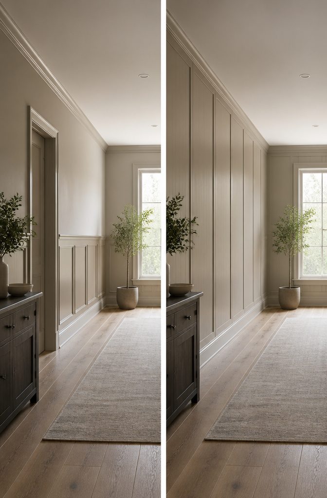
Painting wainscoting the same color as the wall is the quieter choice, and it is usually the one that wins in smaller rooms or anywhere the architecture already does enough talking.
The trim disappears, the eye reads the wall as one continuous plane, and the room feels larger because nothing interrupts it.
I have tried this in a narrow hallway where the original plan was a crisp white contrast, and the same-color option kept the space from feeling chopped into pieces.
A contrasting color, on the other hand, gives the wainscoting a job: it frames the wall, adds visual weight, and can make a large room feel less empty.
The decision comes down to what the room needs, not what looks best in a photograph.
In a space with busy flooring, heavy millwork, or a lot of doorways, same-color paint simplifies. In a room with flat walls and little detail, contrast builds interest where there was none.
The existing palette matters more than most people expect.
A wall color with strong undertones will look completely different on the horizontal planes of wainscoting than it does on the vertical wall above it, so test the paint on both surfaces and check it at different times of day before committing.
I learned that after a sage green that read calm on the wall turned almost muddy on the trim below it.

PLASTPRO PVC TRIM KIT, 2 PIECE: Complete your Plastpro wainscoting panels installation with the matching trim kit. Includes 1 pre-finished white PVC chair rail and 1 base molding with integrated rubber seal that blocks moisture from seeping between wall and panels. Pre-grooved to snap directly onto Plastpro 3 Ft and 8 Ft PVC wall panels.

DIY Installation Made Easy: Cut, peel, and stick in just 3 simple steps. No special tools required. Effortless installation for a quick and hassle-free experience.
DIY Installation Made Easy: Cut, peel, and stick in just 3 simple steps. No special tools required. Effortless installation for a quick and hassle-free experience.
2. White Wainscoting

White wainscoting shows up in more photos, more pin boards, and more advice threads than any other choice.
The reason is practical: white trim against a colored wall gives you contrast without committing to a second color you might tire of.
The eye reads it as architectural detail rather than decoration, which helps when you are renting or planning to sell.
I have painted trim white against sage and navy walls, and the result always felt safer than it felt interesting.
Same-color white, wall and wainscoting together, reads cleaner and makes the room feel larger because the eye does not stop at the chair rail.
The downside is that flaws in the molding stand out more without shadow or contrast to hide them. Dents, uneven joints, or brush marks from a rushed Saturday project become the only thing to look at.
White also fails in rooms with little natural light, where it can go gray or yellow depending on the bulb.
If your walls are already a warm white, matching trim can look like a mistake, like two paint cans that were supposed to be the same batch and were not.
Test the exact sheen, not just the color: eggshell walls with semi-gloss wainscoting in the same white will read as different colors in certain light, and that difference reads as an error, not a choice.
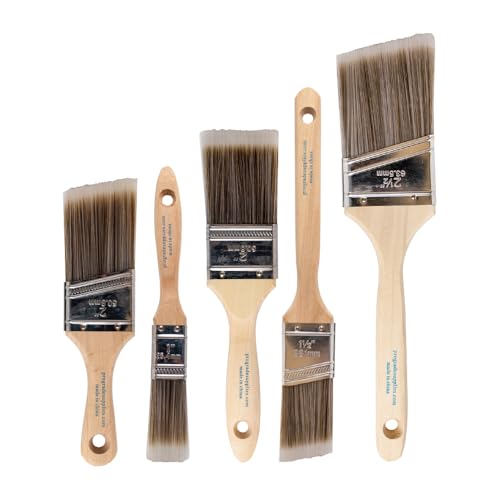
COMPLETE 5-PIECE BRUSH SET FOR EVERY PAINTING TASK — Includes 1 Inch Flat, 1.5 Inch Angle, 2 Inch Flat, 2 Inch Angle Stubby, and 2.5 Inch Angle brush giving you every size professional painters use daily. Get all 5 for less than the price of a single brush from hardware store brands — professional grade performance at a fraction of the cost. Perfect for walls, trim, cabinets, doors, furniture, and detailed cutting-in work on any project.

Paint Roller kit 10 Pack: 2 inch foam paint roller covers 6 pack, 2 inch plastic paint tray, 2 inch paint tray liners 2 pack, small paint roller frame

Flexible purple Shergrip handle that measurers only 2 Inches long that adds maneuverability in tight spaces
3. Bold Colors

Bold navy wainscoting that matches the wall above it turned a cramped powder room in my sister’s first house into the only room people photograph.
She used the same deep blue on beadboard and drywall, keeping trim crisp white so the architecture didn’t dissolve into a single dark box.
The effect works because the color reads as intentional mood rather than mistake; in one video walkthrough, an interior designer traces a similar choice in a client’s dining room where navy wainscoting matched the upper walls but was saved from heaviness by brass fixtures and a pale ceiling.
The risk is real: dark values on both surfaces flatten a small room fast. Owners on Reddit mention seeing a charcoal attempt that shrank the space and made the millwork disappear, which happens when contrast and finish variation are skipped.
If the wainscoting is satin or eggshell against matte walls, light catches the panels and keeps them dimensional even where hue stays identical.
Saturated color on wainscoting also conceals scuffs better than white, but fingerprints and dust show on the flat areas just as they would anywhere; the trade is worth it in a high-traffic hallway, less so if you are already fighting poor natural light.
Jet black or deep charcoal wainscoting paired with matching walls needs warm lighting and lighter floors to avoid a cave effect. Paint the ceiling something other than the wall color or the room loses its lid entirely.

Use to prime interior surfaces such as walls, doors, trim, plaster, concrete and more
DIY Installation Made Easy: Cut, peel, and stick in just 3 simple steps. No special tools required. Effortless installation for a quick and hassle-free experience.

High Quality Material - These molding panels are made of polystyrene material, which is hard and durable, lightweight, odorless, non-warping, and non-cracking. The quality is absolutely superior to that of foam molding panels.
4. Earthy Tones
Sage green wainscoting that matches the wall above it does something white never quite manages: it lets the molding read as architecture instead of decoration.
Shadow lines do the work once the color match erases the usual contrast. In my own living room, I painted the board-and-batten the same muted sage as the drywall, and the room gained about six inches of visual calm.
No stripe cutting the wall in half, no contrast demanding attention when you walk in.
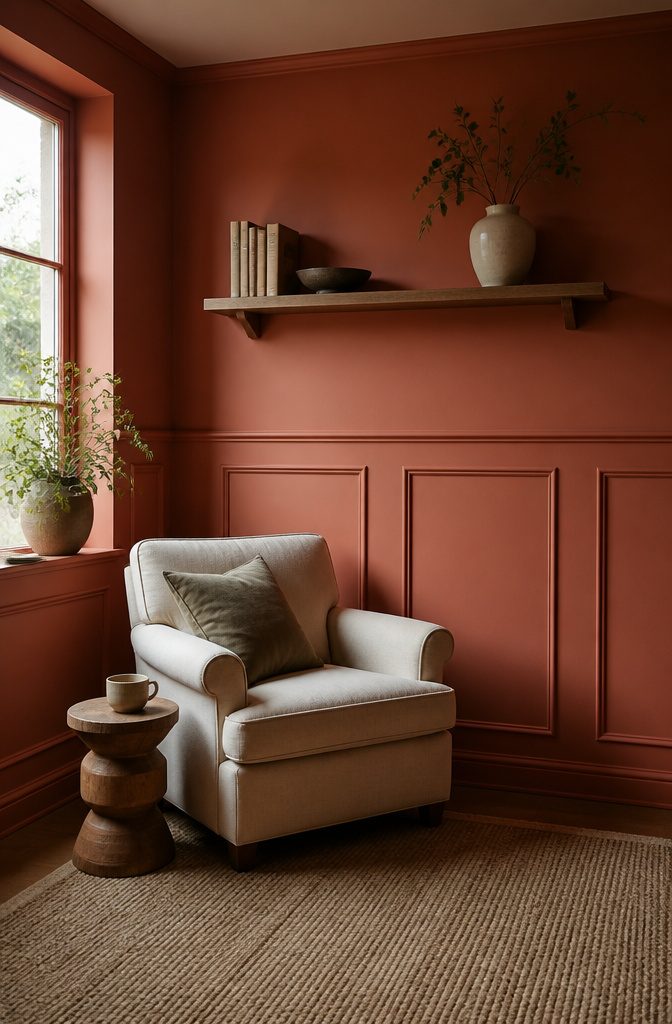
Terracotta and warm browns work the same way, though they need more light than you’d think. A hallway I did in terracotta went from cozy to cave until I swapped the overhead bulb for something closer to daylight.
Earthy tones reward rooms that already get good sun, or rooms where you want to feel enclosed: a reading corner, a powder room, the wall behind a bed. The color wraps around you instead of framing itself for display.
The trick with brown specifically is staying warm enough.
Anything that drifts toward gray-purple reads muddy against most wood floors. Test it at the floor line, not eye level, where the light is weakest and the baseboard meets whatever wood you already own.

TIGHT, STRONG SEALS — This Sika polyurethane sealant offers exceptionally secure adhesion while also allowing for a high elasticity that helps prevent cuts and tears

IDEAL FOR: SEALING JOINTS, REPAIRING CRACKS AND FILLING GAPS FOR INTERIOR APPLICATIONS AND PRE-PAINT PREPARATION.

Quick DIY Installation: This Wall Molding Kit includes pre-cut peel and stick wainscoting panels, lightweight and ready to install. No special tools required, making it simple for anyone to use
5. Muted Colors

A soft gray on both wall and wainscoting reads as architecture rather than decoration, which is exactly why muted colors work in narrow hallways or small rooms where bold contrast would chop the space into pieces.
Dusty blue operates the same way, but adds a layer of calm that registers on peripheral vision without demanding attention the way navy would.
Pale green is the one I keep steering people toward for north-facing rooms where everything feels flat.
The yellow undertone in a sage or muted olive bounces warmth back into the space, yet stays quiet enough that the wainscoting panels themselves, not the color, become what you notice first.
That hierarchy matters. Bold paint draws the eye to the paint itself; muted paint lets the carpetry read.
The practical difference shows up in resale too, or so the pattern in projects I have tracked suggests. A renter or first-time owner painting wainscoting the same color as walls is already making a commitment to subtlety.
Muted tones protect that investment because they tolerate slightly different sheens between wall and trim without the mismatch screaming. Satin wainscoting against matte walls in a medium gray?
Visible only when light hits directly. Try that with a saturated teal and the gloss differential announces itself from the doorway.

Effortless Installation — Experience the simplicity of our 3-step installation process: simply cut, peel, and stick. It's a swift, hassle-free process.
DIY Installation Made Easy: Cut, peel, and stick in just 3 simple steps. No special tools required. Effortless installation for a quick and hassle-free experience.
DIY Installation Made Easy: Cut, peel, and stick in just 3 simple steps. No special tools required. Effortless installation for a quick and hassle-free experience.
6. Textured or Patterned Wainscoting

Beadboard and board-and-batten wainscoting can carry a whole room even when the paint matches the wall exactly. The shadow lines between boards do the visual work that a second color normally would, so the texture itself becomes the feature.
I learned this the hard way in a hallway where I tried to save money by skipping the top rail and just painting beadboard the same cream as the drywall above.
Without that shadow gap at the cap, the boards looked like a flat panel someone had glued on.
The fix was simple enough: add the rail, keep the color identical, and suddenly the grooves caught light differently at every hour of the day.
A 1/4-inch reveal between boards is usually enough to read as texture from across a room.
Anything tighter, and you might as well have painted the wall flat. For renters, peel-and-stick beadboard exists now in actual wood veneer, and the seams register as real shadow because they are real gaps.
I have not used it in a bathroom, but the product specs suggest it handles steam about as well as any laminate flooring, which is to say, poorly. Stick to dry rooms if you go that route.

Bates paint roller kit includes 19 essential pieces for home painting, prep, and cleanup projects.

COMPLETE 12-PC PROFESSIONAL SET:Includes 4" tray ×1, snap-fit handle ×1, reusable liners ×2, liner cover ×1, dual-brown microfiber sleeves ×4, white microfiber sleeves ×2, and 1.5" angled brush ×1. Perfect for walls, ceilings, trim, cabinets, and furniture

PAINT TRIMMING TOOL: The Wagner SMART Edge Roller home painting tool makes painting a room easier and more enjoyable by eliminating hours of taping and cut-ins
Color Combinations
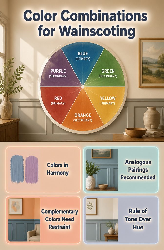
The color wheel still lives on the wall of my workroom, the cheap paper one from the paint store, faded at the edges where afternoon sun hits.
Blue sits at twelve o’clock, yellow at four, red at eight. Those three primaries spin out the secondaries between them: green, orange, purple.
Colors closer together on the wheel, like blue and purple, settle into each other without a fight; opposites across the dial, like blue and orange, push back and create energy.
For wainscoting same color as wall, this matters less than you’d think. When the wainscoting matches the wall, you’re working with tone and depth, not hue.
The wheel becomes useful when you want the trim to whisper against a slightly different wall color, or when you’re choosing accents in the room that will live above the rail.
Analogous pairings, neighbors on the wheel, let the eye move smoothly up the wall. Complementary schemes, opposites, need restraint; the wainscoting itself should stay quiet so the art or fabric above it can carry that tension.
I once painted a dining room in a blue-gray and tried to pair it with a warm peach trim, chasing complementary contrast.
The wainscoting looked seasick, neither warm nor cool enough to commit. The room needed the trim to be two steps closer on the wheel, a grayed green that shared DNA with the wall rather than arguing with it.
Rules on the wheel are a starting point, not a promise. The paint chip in your actual light is what closes the sale.

High Quality Material - These molding panels are made of polystyrene material, which is hard and durable, lightweight, odorless, non-warping, and non-cracking. The quality is absolutely superior to that of foam molding panels.
High Quality Material - These molding panels are made of polystyrene material, which is hard and durable, lightweight, odorless, non-warping, and non-cracking. The quality is absolutely superior to that of foam molding panels.

Includes: 3 pre-cut 20"x27" wall molding frames and 2 chair rail trim pieces, Covers 78.7"W x 39.9"H wall area (6.5 ft wide). All pieces feature a peel-and-stick design for easy installation.
Painting Steps That Matter

- Buy one quart of paint before committing to gallons. The color on the chip and the color on your wall are two different colors, and the only way to see the real one is to paint a piece of foam board and move it around the room through a full day of light. I skipped this once for a bathroom wainscoting project, painted the whole thing after a noon swatch looked right, and by evening the north-facing light had turned it hospital-corridor gray.
- Measure the room and figure roughly one gallon per 400 square feet. Plan on extra if the surface is textured, rough, or unprimed; the wainscoting catches more paint than flat drywall.
- Once you have multiple cans, pour them all into a single bucket and mix. The color mixer at the store can shift slightly from can to can, and two quarts of "same" color will read as two colors once they dry side by side on molding.
- Let the paint dry at least 24 hours before moving furniture back. I have pushed it to twelve, leaned a chair against the trim, and peeled a palm-sized patch off with the chair back.
- Pour leftovers into small jars, label them with the exact color and sheen, and store them. Touch-ups on same-color wainscoting are invisible only when the paint is identical, and "close enough" reads as a smudge from across the room.

Crown Molding Specifications:Width and height both 9/16 inches. Easily adheres to various smooth surfaces, providing powerful sealing for common gaps. Effectively blocks dust, moisture, grease, and Ants while enhancing home aesthetics. An ideal protective choice for DIY home projects

Pre-cut Wall Molding Kit : Our wall moldings include 22 pieces of 24 inch decorative strips and 12 pieces of 30 inch decorative strips.Can be freely matched according to your needs,bringing an elegant finished appearance to doors or walls
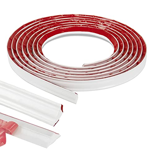
DURABLE AND FLEXIBLE - 3/4inch(width) x 16feet(length) flexible trim, made of high quality PVC material.
Wainscoting Styles
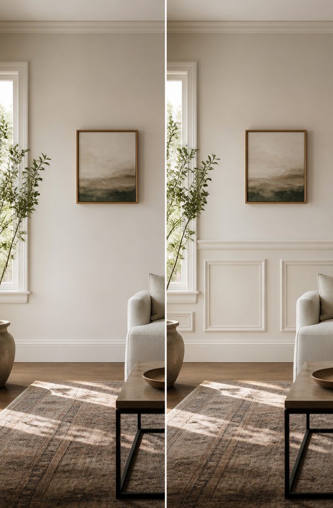
Raised panel wainscoting makes the strongest case for going same color as the wall.
The molding depths and stepped edges already throw shadows that read as texture, so matching the paint lets those shadows do the work instead of fighting them with contrast.
Flat panel pulls the opposite trick: its cleaner planes look almost like a color block already, and any mismatch between the wall and the wainscot paint draws the eye straight to the seam.
Owners on Reddit mention that in older houses with slightly bowed drywall, flat panel turned every ripple into a spotlight; raised panel hid the same flaws behind its own geometry.
Raised panel rewards the effort because the grooves still read even without color change, and the pre-routed kits skip the coping saw work entirely.
The ogee edge profile felt traditional enough without looking like a courtroom, and painting it the same warm white as the walls meant I could skip taping the upper edge entirely.
One weekend, two gallons, and the mistakes mostly hid under the crown of a profile edge before I even touched them up.

Ready to use, pre-mixed door and trim paint offers a fresh new look on interior or exterior metal, wood and fiberglass

【Extra Long Size】Measuring 23ft x 1.1" in length, our peel and stick wall molding offers perfect coverage for various applications. The ultra-soft material cuts easily with scissors, allowing you to customize the perfect fit for any project - whether you need short sections for cabinet edges or long runs for wall applications.
Frequently Asked Questions
Can I paint wainscoting the same color as my walls?
Yes, and it often works better than contrast in smaller rooms or spaces with busy architecture. The trim disappears, the eye reads the wall as one continuous plane, and the room feels larger because nothing interrupts it.
Test the paint on both surfaces first; strong undertones can read completely differently on horizontal wainscoting than on vertical walls above it.
What is the golden rule for wainscoting?
The decision comes down to what the room needs, not what looks best in a photograph.
Same-color paint simplifies spaces with busy flooring, heavy millwork, or many doorways; contrast builds interest in flat rooms with little detail. Let the architecture and existing conditions guide the choice rather than following a fixed rule.
Should wainscoting be lighter or darker than walls?
Neither is inherently correct. Same-color wainscoting makes rooms feel larger and calmer; contrasting wainscoting adds visual weight and frames the wall.
Dark matching colors can flatten a small room fast, so vary the finish, satin or eggshell wainscoting against matte walls, to keep panels dimensional even when the hue stays identical.
Does wainscoting need to be the same color as trim?
No, and mixing the two can add deliberate structure. One successful approach pairs same-color wall and wainscoting with crisp white trim so the architecture does not dissolve into a single block.
Intention matters: a difference in color or sheen only works if it looks chosen. Eggshell walls with semi-gloss trim in the same white can look accidental, so test the exact pairing before you commit.
What colors work best for wainscoting?
White, bold colors like navy or charcoal, earthy tones such as sage and terracotta, and muted grays or dusty blues all work, depending on the room.
White reads as safe architectural detail; saturated colors create intentional mood; earthy tones reward sunny rooms with visual calm; muted colors let the carpentry itself become what you notice. The existing light and palette matter more than the color’s popularity.
How much paint do I need for wainscoting?
Plan on roughly one gallon per 400 square feet, with extra for textured, rough, or unprimed surfaces since wainscoting catches more paint than flat drywall.
Buy one quart to test before committing to gallons, and if you end up with multiple cans, pour them into a single bucket and mix to avoid slight shifts from can to can that read as two colors once dry.